Built with love by Lazar Dragos George. The content may not be distributed without my permission.
5 February 2025
A Simple CSS Trick to Elevate Your Typography
The Problem with Unbalanced Text
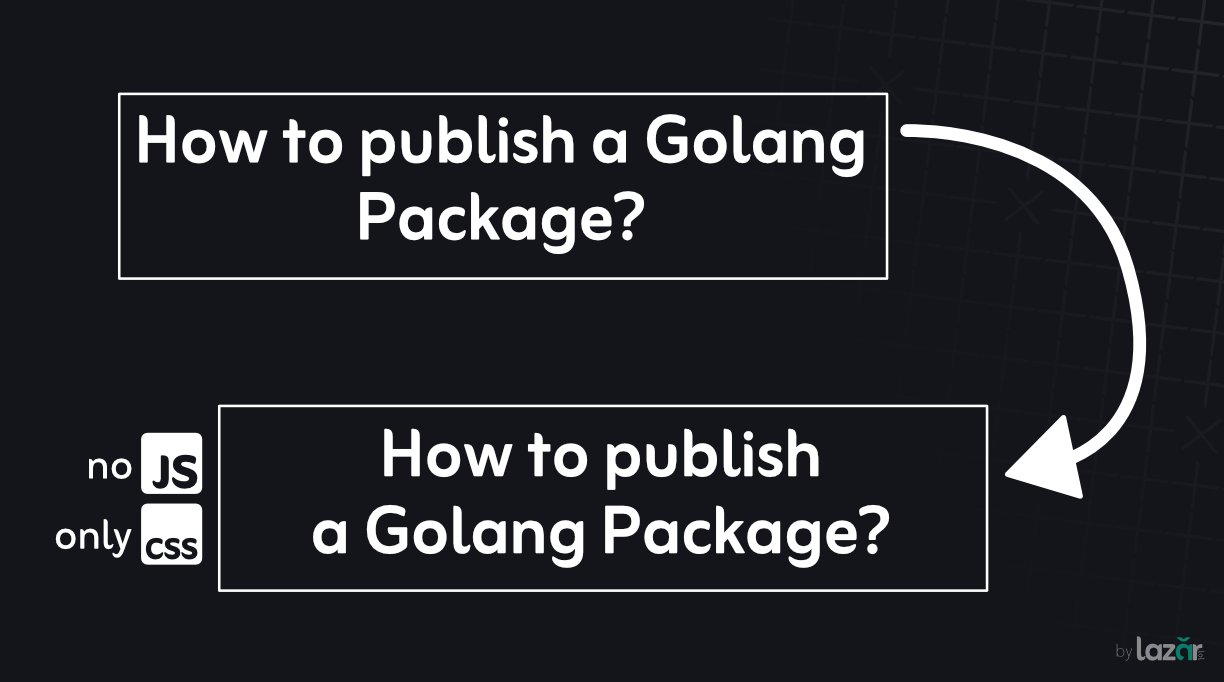
We've all seen it: headlines with awkward line breaks, where a single word dangles alone, breaking the visual flow of your design. It's not just aesthetically displeasing-it impacts readability and user experience.
Enter text-wrap: balance
This new CSS property solves typography headaches with one simple line of code.
Quick Implementation
.headline {
  text-wrap: balance;
}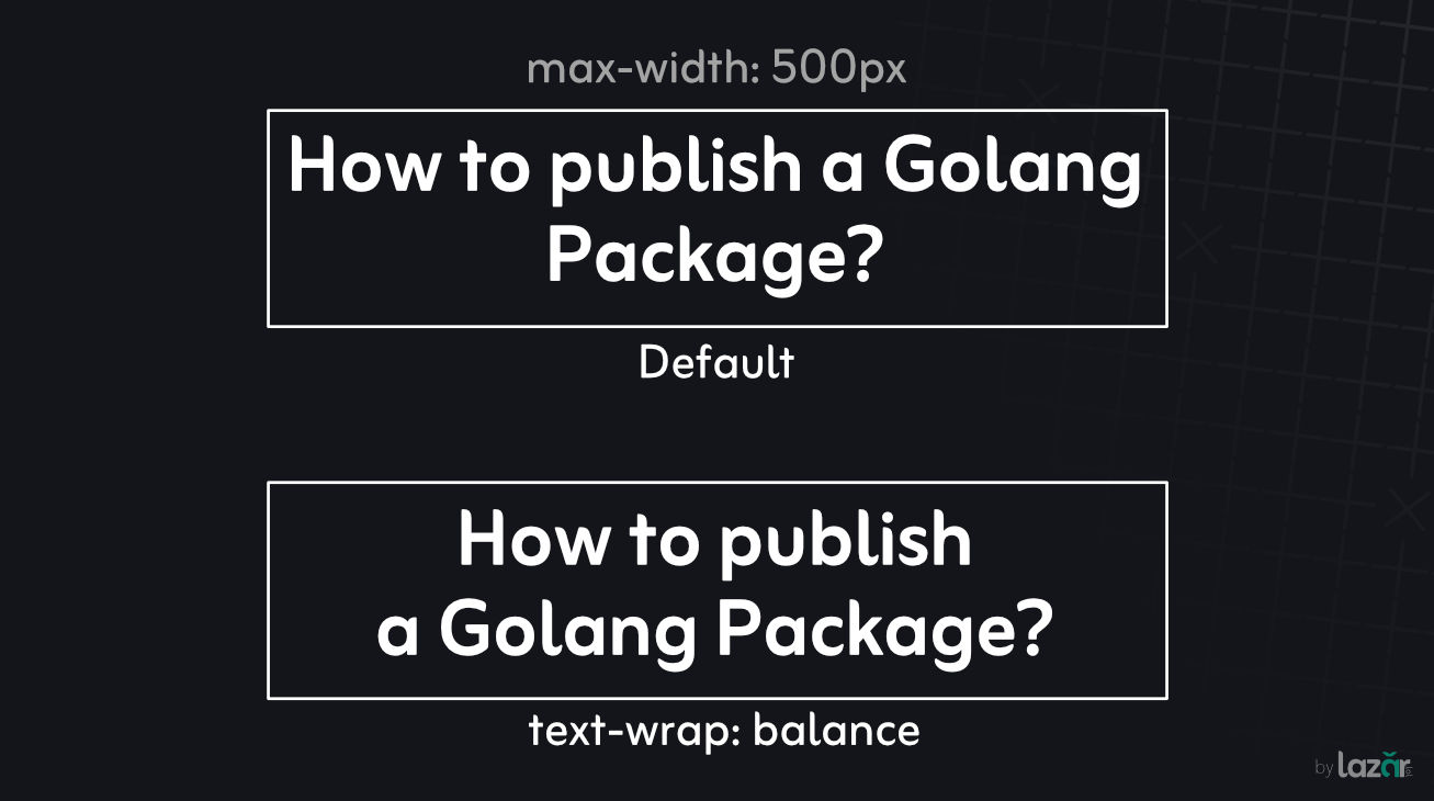
Default vs Balanced Titles
Pro Tips
- Use sparingly on short, critical text elements
- Combine with max-width for best results
- Test across different screen sizes
- Disclaimer: Always check current browser compatibility and test across different devices and browsers.
Further Reading & Resources
- MDN Web Docs: CSS text-wrap Property
- Browser Compatibility: Can I Use text-wrap
Typography just got easier. Happy coding!